Campaign Description
The internet habits of consumers have evolved, with the mobile phone supplanting the desktop computer as the main tool used to search for information. That shift has led to a change in thinking on website design and the need to make it more smartphone-oriented. The Taiwan branch of the Philippine Department of Tourism decided to refresh its website to account for changing consumer habits and make it more intuitive and user-friendly to browse.
We undertook the new design based on mobile phone webpage principles:
1.Simplified and positioned important information on the home page, enabling users to get a beat on the main attractions and activities in the Philippines at a glance.
2.Single page/single column page format: Mobile phone screens are far narrower than desktop screens, and users are accustomed to scrolling to look for information. Thus, websites for desktop screens with multiple columns needed to be redesigned into a single column so that users can easily scroll down to find information of interest.
3.Font sizes were made bigger and less text was shown on the home page, reducing bounce rates caused by users finding it hard to read the text shown.
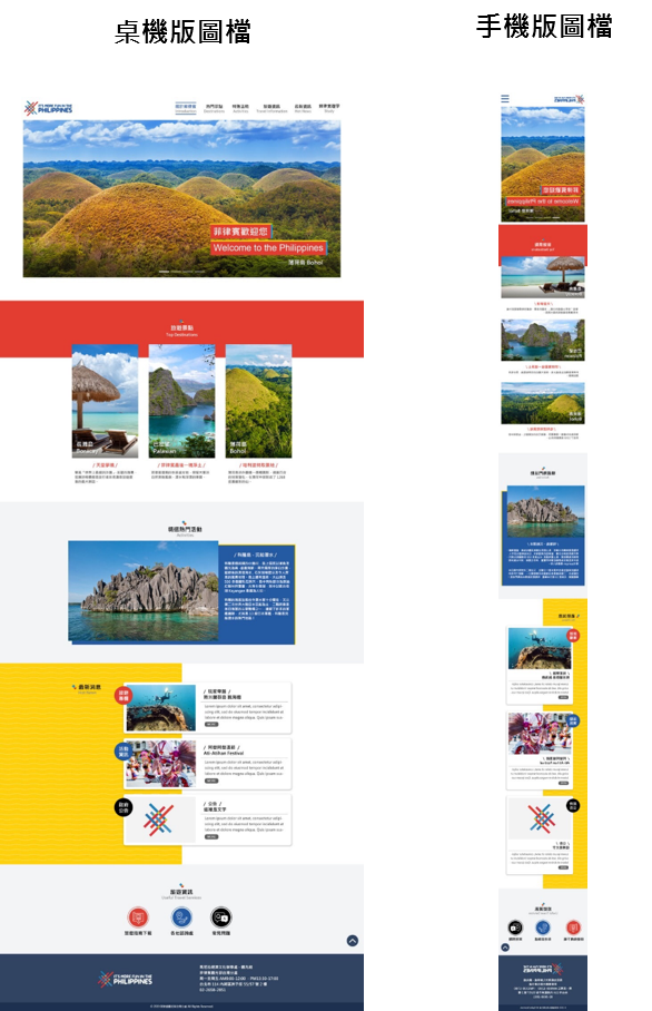 4. To encourage users to stay longer on the website, we added a special “Follow Your Interests” section at the bottom of the “Destinations” webpage that users could click on and browse to get additional information.
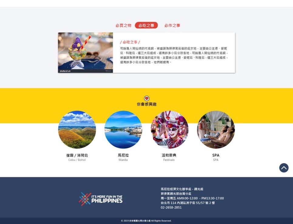
The Philippines is known as the “country of a thousand islands,” and each region has its own distinctive features or foods. We made it a point to add a “Must See/Must Try/Must Buy” section for every destination page to help users get a quick feel for each area’s best places to visit, the local food specialties, and where to shop.
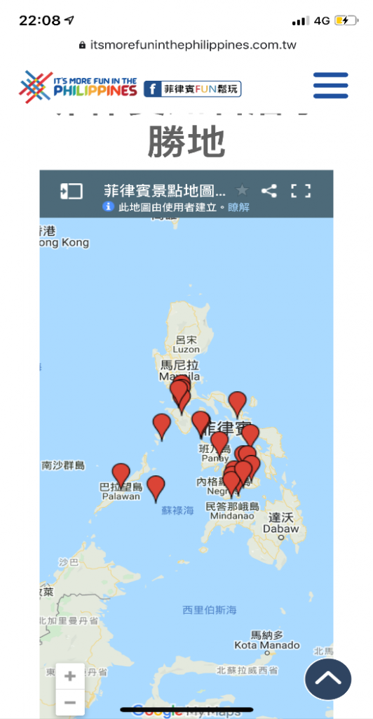
5. The Philippines is internationally renowned for its many diving destinations and beaches. To make sure users could conveniently identify where each destination is located, we added Google maps to the “Diving” and “Beach” activities webpages.